Four studies, start to finish.
We started Mediamail recently, so we'd rather show our thinking than a wall of borrowed logos. Each study below takes a typical small business, looks honestly at what's wrong, and rebuilds it the way we would for a paying client.
About these studies. The businesses are fictional, so you won't find them on a map. The design, the code and the workflow are real and ours. Every screenshot on this page is of a page we built. When client projects go live with permission to share, they'll appear here too.
Forno Bianchi
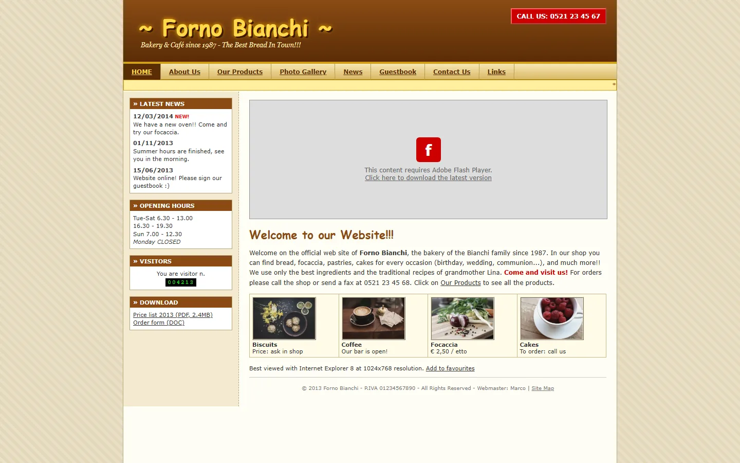
A family bakery with a loyal neighbourhood and a website from 2013 that nobody had opened in years. People were phoning to ask about opening hours that were already on the site, just buried in a sidebar.
What was wrong
- A Flash banner that hasn't worked since 2020
- Opening hours hidden in the left column
- Orders by phone or fax only
- Unreadable on a phone, with 11px text
What we changed
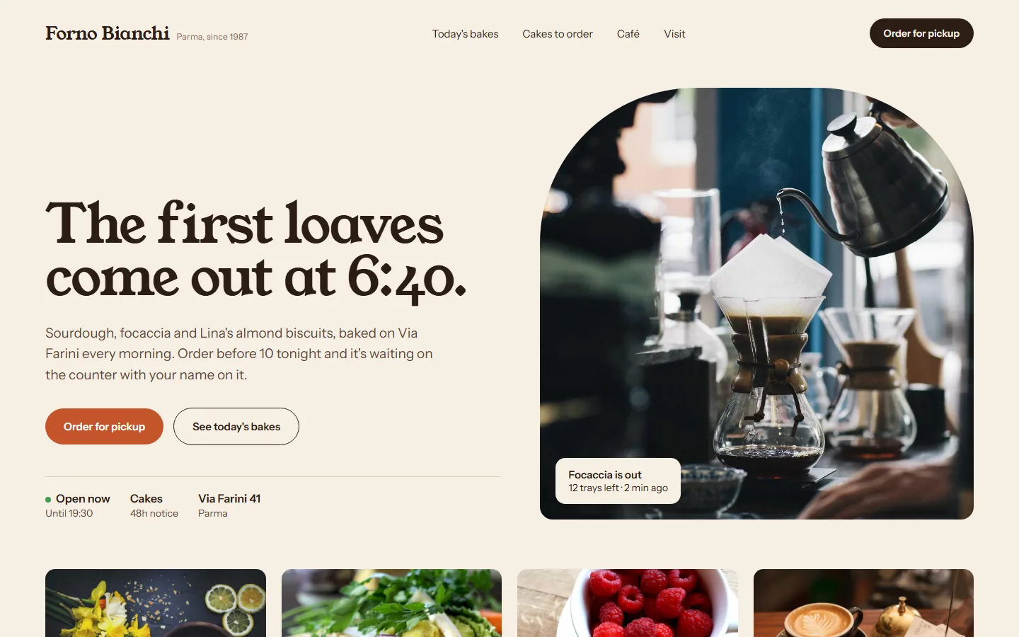
- The first screen answers the three questions people actually ask: what's fresh, are you open, where are you
- Order-for-pickup online, with a cut-off at 10pm for the next morning
- Prices and cake lead times in plain sight
Why it matters
A bakery doesn't need a big website. It needs one that saves the person at the counter from answering the same phone call twenty times a day, and that turns "I'll stop by sometime" into an order with a name on it.
Vigna Alta
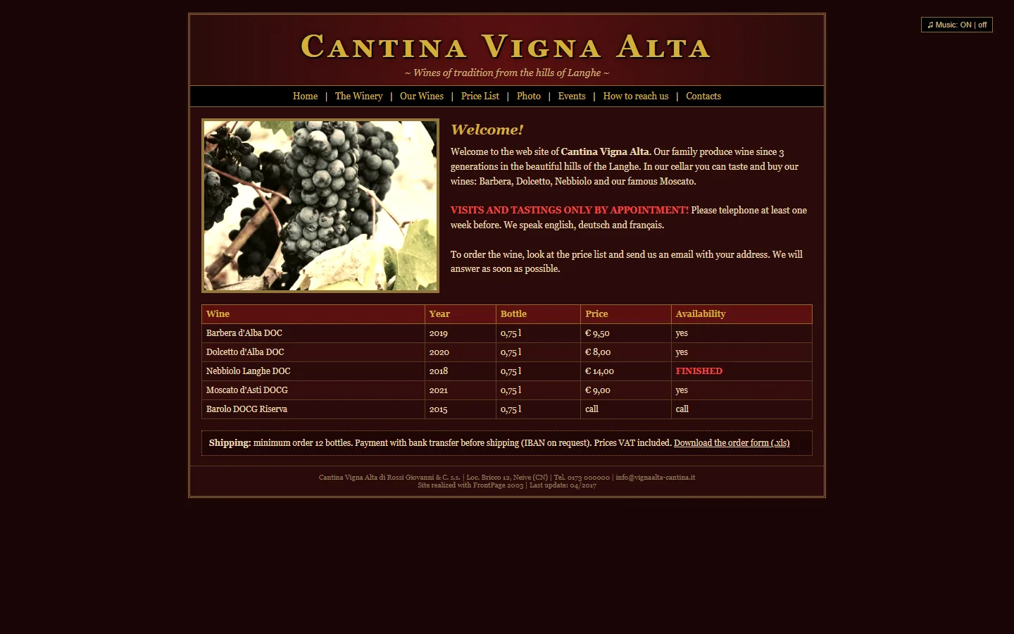
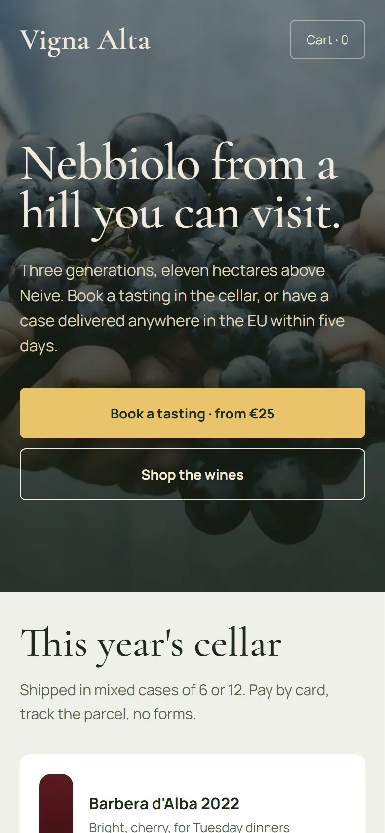
Three generations of winemaking, and a FrontPage site where buying a case meant reading a price table, emailing an order, waiting for bank details, and sending a transfer. The site was turning away exactly the customers it was meant to attract.
What was wrong
- No way to pay online, minimum 12 bottles
- Tastings by phone "at least one week before"
- Sold-out wines still listed, prices from 2017
- Background music on page load
What we changed
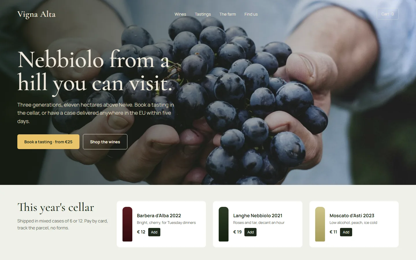
- Online shop with card payment and mixed cases of 6
- Tasting booking with a real calendar and confirmation email
- Stock that updates itself, so "finished" wines disappear
- Short tasting notes written like a person, not a label
Why it matters
Visitors who loved the wine on holiday used to give up at "send us an email". Now they reorder from home in a couple of minutes, and the family spends less time on the phone and more in the vineyard.
Kinetica Physio
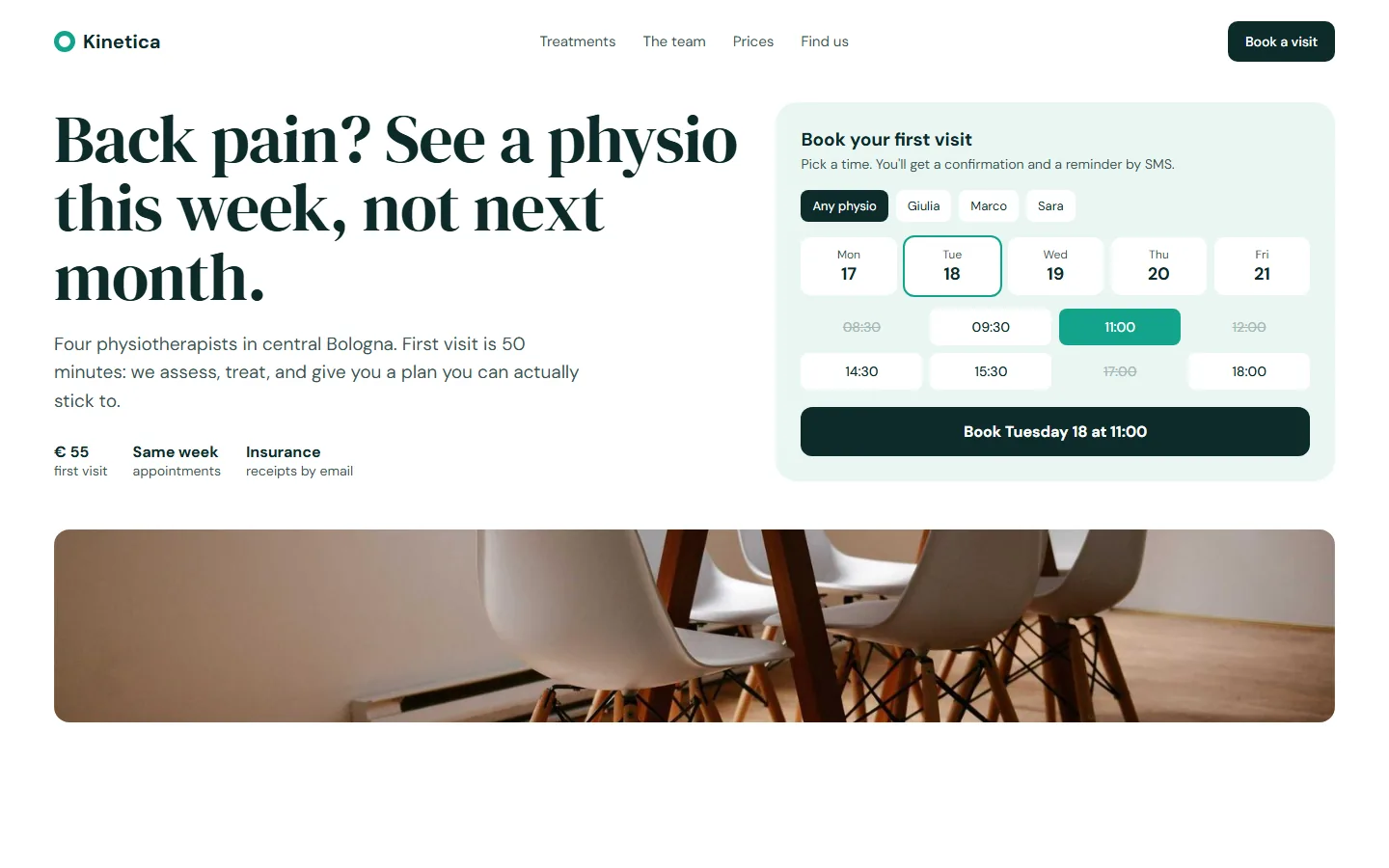
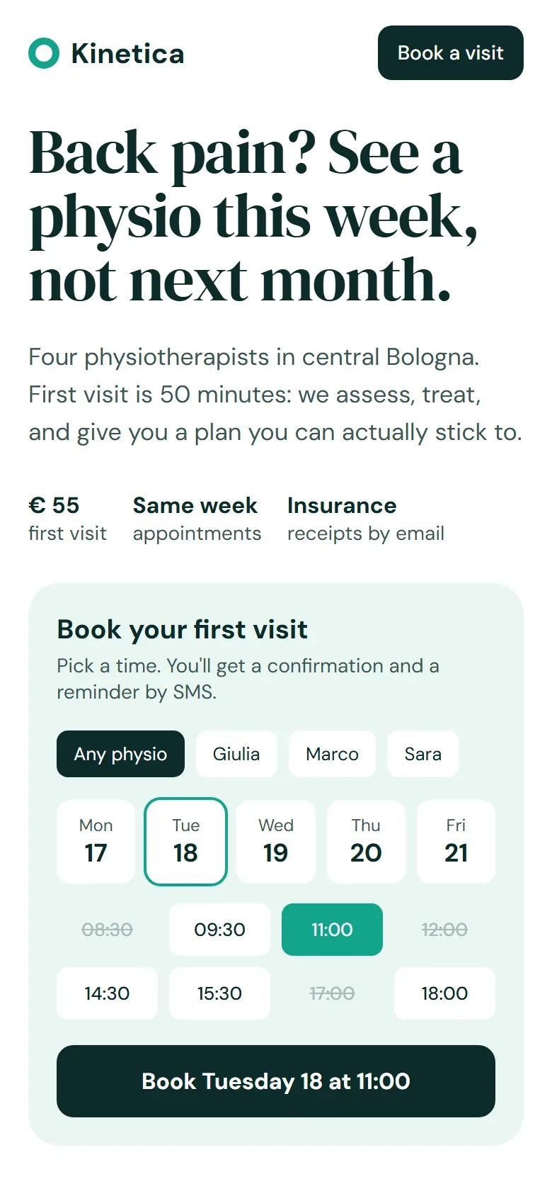
A new clinic with four physios and no website at all. Every booking came through a shared phone that rang during treatments. The brief was simple: let people book a first visit without calling.
The brief
- Book a first visit in under a minute
- Price visible, no "contact us for pricing"
- Insurance receipts sent automatically
What we built
- Booking right on the homepage, synced with each physio's calendar
- SMS confirmation and a reminder the day before
- Receipts emailed after the visit, ready for insurance claims
Why it matters
Missed calls are missed patients. Booking online means people can book at 11pm when their back hurts, and the phone stops interrupting treatment.
Studio Conti
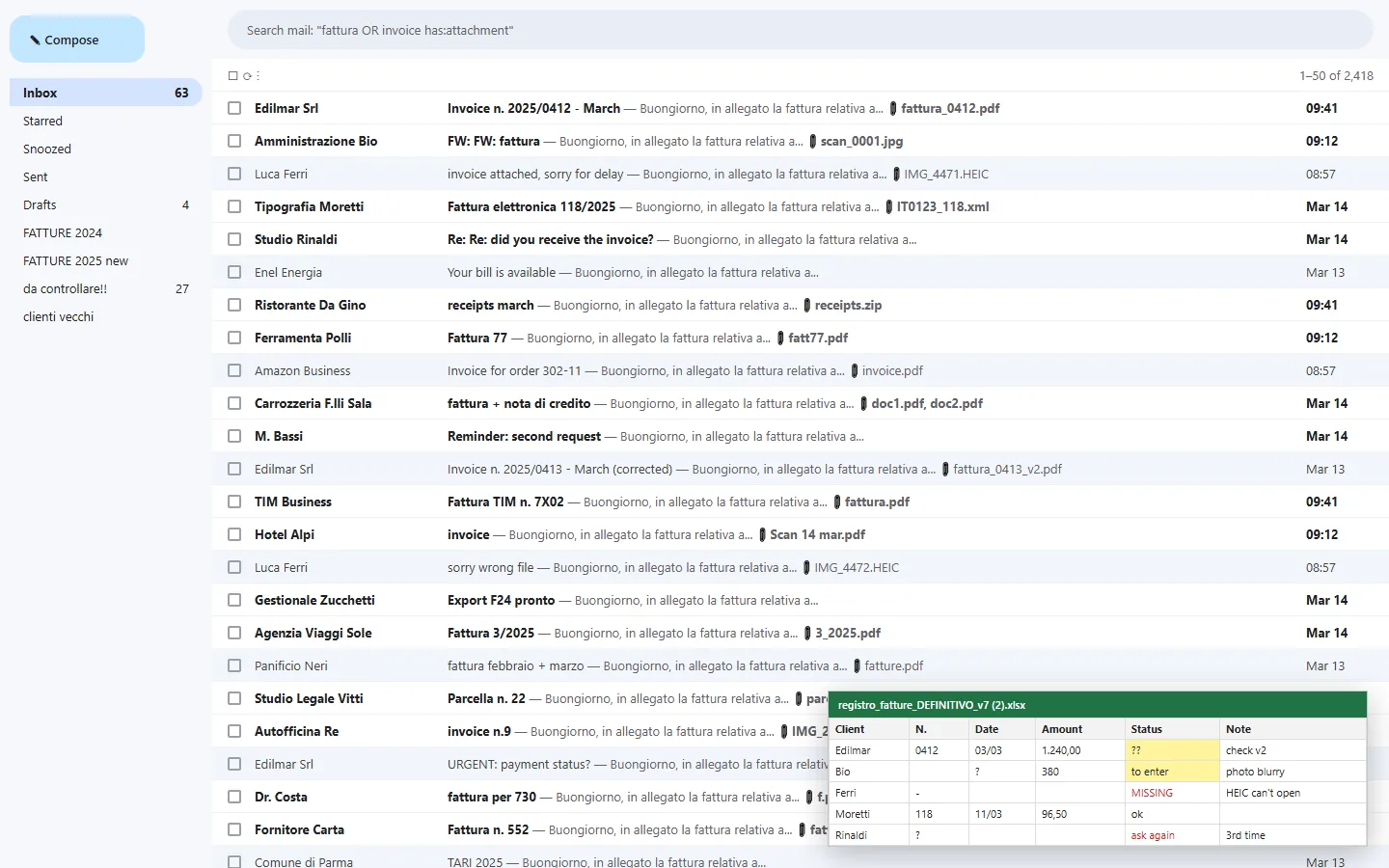
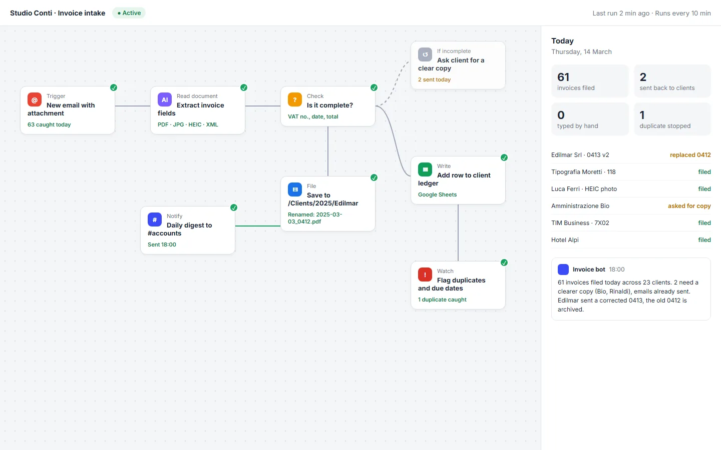
An accounting office receiving around sixty invoices a day by email, in every format imaginable. Two people spent their mornings opening attachments and typing numbers into a spreadsheet called registro_fatture_DEFINITIVO_v7 (2).xlsx.
What was wrong
- Hours a day typing invoice data by hand
- Phone photos and HEIC files nobody could open
- Corrected invoices filed twice
- Clients chased for missing documents, three times
What the workflow does
- Picks up every email with an attachment
- Reads the invoice, including blurry photos
- Checks that VAT number, date and total are present
- Files it, adds it to the ledger, flags duplicates
- Asks the client for a clear copy when needed
Why it matters
The team didn't get replaced. They stopped doing data entry and started doing the work clients actually pay an accountant for. The spreadsheet is now correct, and it has one version.
Want your business to be the next study?
Tell us what you have and what bothers you about it. We'll come back with honest first thoughts within one working day.
Start a project